Dashboard Design Best Practices: dashboard design best practices for clarity

In the SaaS world, a dashboard is more than a collection of charts and numbers; it's your user's command center. A poorly designed dashboard leads to confusion, frustration, and ultimately, churn. Conversely, a great one empowers users, accelerates decision-making, and becomes a core reason they stick with your product. Effective dashboards don't just present data, they tell a story and guide the user toward their next, most logical action.
This guide moves beyond generic advice. We will explore 10 specific, actionable dashboard design best practices, providing the tactical details you need to transform your data displays from cluttered canvases into powerful tools for user success. The principles we cover are universal, but their application can be highly specialized. For a specialized perspective on applying these practices in a high-stakes, data-intensive environment, you might find valuable insights in this article on Top Dashboard Design Best Practices for Traders.
Whether you're an early-stage startup founder building a new feature or a product team refining an existing interface, these principles will help you create dashboards that are not only beautiful but truly effective. You will learn how to prioritize information, ensure accessibility, optimize for performance, and drive user action, turning your dashboard into a genuine competitive advantage.
1. Clear Information Hierarchy and Visual Prioritization
Effective dashboard design best practices begin with a strong information hierarchy. This principle involves strategically organizing and presenting data to guide the user's attention to the most critical information first. By using visual cues like size, color, contrast, and placement, you create a clear path for users to follow, preventing cognitive overload and enabling them to grasp key insights instantly.
For example, the Stripe dashboard immediately draws attention to primary revenue and transaction volume metrics at the top. Similarly, a Refgrow affiliate dashboard should prominently display total referral earnings and conversion rates, placing secondary details like click-through rates or individual link performance in less prominent positions. This ensures affiliates can assess their success in seconds.
How to Implement Visual Hierarchy
To apply this principle, start by categorizing your data into primary, secondary, and tertiary levels of importance. Then, use proven design patterns to structure the layout.
- Follow the F-Pattern: For Western audiences who read from left to right, place the most crucial data in the top-left quadrant of the screen. This area receives the most initial attention.
- Use Size and Contrast: Make key performance indicators (KPIs) and their corresponding values significantly larger and bolder than other elements on the page. Use contrasting colors to make primary call-to-action buttons or critical alerts stand out.
- Leverage Whitespace: Ample whitespace around important metrics helps to isolate them from less critical data, giving them visual breathing room and drawing the user's eye.
By mastering visual hierarchy, you empower users to make faster, more informed decisions, which is the ultimate goal of any well-designed dashboard. For a deeper dive into presenting data within your product, explore these concepts in the context of embedded analytics for SaaS.
2. Real-Time Data Updates and Performance Metrics
A static dashboard is an outdated one. To empower users to make timely decisions, it's essential that dashboards display live or near-real-time data. This practice keeps users informed of current performance, transforming the dashboard from a historical report into a dynamic operational tool. Data latency can mean the difference between capitalizing on an opportunity and missing it entirely.
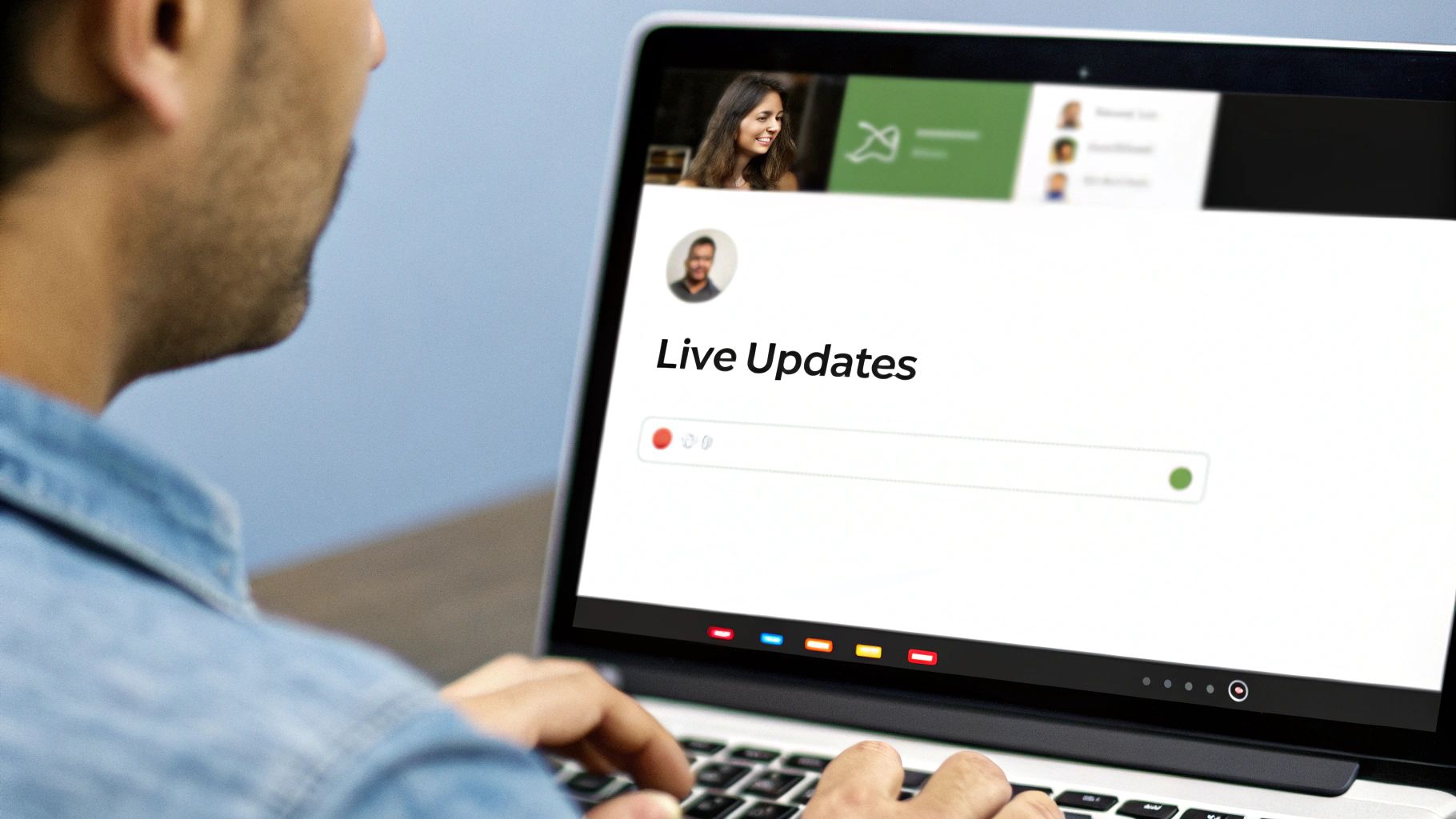
For an affiliate platform like Refgrow, this is non-negotiable. Affiliates need instant notifications when a referral converts to see the immediate impact of their efforts. Similarly, e-commerce dashboards like Shopify showcase live sales activity, giving merchants a real-time pulse on their business. The goal is to create a responsive environment where data reflects the present moment.
How to Implement Real-Time Updates
Delivering live data requires a thoughtful approach to both backend architecture and frontend design to ensure performance and clarity.
- Use Smart Refresh Rates: Implement varied refresh intervals. Critical KPIs like new conversions might update every 5-10 seconds, while secondary data like historical trends can refresh every 30-60 seconds to reduce server load.
- Provide Visual Feedback: Use subtle animations, like a pulsing icon or a gentle fade-in, to indicate that data is updating. This assures users the information is fresh without being disruptive. Also, include a manual refresh button for user control.
- Leverage Event-Driven Architecture: For SaaS platforms, use technologies like webhooks to push updates instantly when an event occurs (e.g., a new sale). This is more efficient and accurate than constant polling.
By prioritizing live data, you create a more engaging and valuable user experience. This approach helps users track key performance indicators that are crucial for growth, a concept further explored in our guide to essential customer success metrics.
3. Responsive and Mobile-First Design
In today's multi-device world, one of the most crucial dashboard design best practices is ensuring a seamless experience across desktops, tablets, and smartphones. A responsive, mobile-first approach prioritizes the user experience on the smallest screens first, then progressively enhances the layout for larger ones. This ensures that core data and functionality remain accessible and usable, no matter how a user accesses the dashboard.

For a Refgrow affiliate dashboard, this is non-negotiable. Indie founders and growth teams frequently check performance on the go. A mobile-optimized view allows them to quickly see referral earnings or share a link from their phone. Similarly, Slack's mobile app effectively condenses workspace analytics into a digestible mobile format, proving that complexity can be simplified without losing value.
How to Implement Responsive Design
Adopting a mobile-first philosophy simplifies the design process by forcing you to focus on the most essential information first. This clarity then translates effectively to larger screens.
- Design for Mobile First: Begin the design process with the smallest viewport. Identify the most critical KPIs and actions, then build the layout for larger screens by adding secondary information.
- Use a Flexible Grid: Implement a fluid grid system and use CSS media queries to define breakpoints for different screen sizes (e.g., 320px for mobile, 768px for tablet, 1024px+ for desktop).
- Prioritize Touch-Friendly Interactions: Ensure buttons and interactive elements are large enough for easy tapping. Avoid reliance on hover-only interactions, as they do not work on touch devices.
- Test on Real Devices: Browser emulation is a good start, but nothing beats testing on actual smartphones and tablets to identify real-world usability issues with performance and touch interactions.
By building dashboards that adapt gracefully to any screen size, you provide consistent value and ensure users can access critical insights whenever and wherever they need them.
4. Customizable Views and Filtering Options
One of the most powerful dashboard design best practices is to give users control over the data they see. A one-size-fits-all approach rarely works, as different users have unique questions and goals. Providing customizable views and robust filtering options empowers them to slice and dice data, transforming a static report into a dynamic analytical tool that serves their specific needs.
For example, HubSpot's reporting tools allow users to create custom views with specific date ranges, metrics, and filters. A Refgrow affiliate dashboard can apply this by letting users filter referrals by status (pending, approved), commission tier, or a specific date range, helping them focus on what matters most to their business and optimize their strategies accordingly. This flexibility caters to both power users and novices through smart defaults.
How to Implement Customization and Filtering
To effectively integrate this principle, focus on building an intuitive interface that makes data exploration easy, not overwhelming. The goal is to offer flexibility without sacrificing simplicity.
- Provide Smart Defaults: Design the default dashboard view to satisfy the needs of the majority of your users. Pre-select common filters like "Last 30 Days" so the dashboard is immediately valuable.
- Use Clear Filter UI: Implement intuitive controls like dropdown menus for categories, dedicated date pickers, and visible tags or "chips" for active filters. This clarity prevents confusion and shows users exactly what data they are viewing.
- Enable Saved Views: Allow users to save their frequently used filter combinations and custom report configurations. This feature, popularized by tools like Tableau and Airtable, saves time and encourages deeper, repeated analysis.
By giving users the tools to personalize their experience, you turn a dashboard from a simple monitoring screen into an indispensable resource for discovery and decision-making.
5. Contextual Help, Tooltips, Guidance and Accessibility
A visually appealing dashboard is ineffective if users don't understand the data it presents. Integrating contextual help and prioritizing accessibility ensures every user can interpret metrics and navigate features confidently. This involves providing non-intrusive guidance through tooltips and overlays while building an inclusive experience that accommodates users with disabilities.
For example, a Refgrow affiliate dashboard should use tooltips to explain terms like 'commission structure' or 'attribution window'. This proactive support removes ambiguity without cluttering the interface. Similarly, by adhering to Web Content Accessibility Guidelines (WCAG), you ensure the dashboard is usable by people with visual, motor, or cognitive impairments, broadening your user base and creating a truly user-centric product.
How to Implement Contextual Help and Accessibility
Combine on-demand guidance with foundational accessibility standards to create a supportive and inclusive environment. This approach is a core component of effective dashboard design best practices.
- Provide On-Demand Explanations: Use small question mark icons (?) next to complex terms or charts. When a user hovers or clicks, a concise tooltip should appear explaining the metric, like how a 'click-through rate' is calculated.
- Ensure Keyboard Navigability: All interactive elements, including filters, date pickers, and chart drill-downs, must be fully operable using only a keyboard. This is critical for users with motor disabilities who cannot use a mouse.
- Prioritize Color Contrast and Semantics: Use a color contrast ratio of at least 4.5:1 for text to ensure readability for users with low vision. Structure the dashboard with proper semantic HTML (headings, lists, and ARIA labels for icons) so screen readers can interpret the layout correctly.
By embedding guidance and building for accessibility, you reduce user friction and support tickets. To explore how this ties into a user's initial experience, see these onboarding UX design principles.
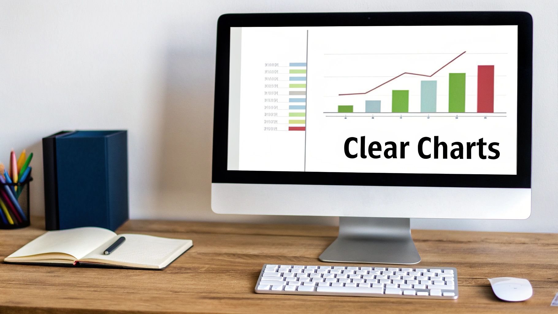
6. Data Visualization Best practices (Charts and Graphs)
Effective data visualization is the backbone of any insightful dashboard. This practice involves selecting the right chart or graph to represent data, allowing users to quickly understand trends, patterns, and comparisons. A well-chosen visualization translates raw numbers into a clear narrative, making complex information immediately digestible and actionable for users.
For instance, Google Analytics effectively uses line charts to show website traffic trends over time and bar charts to compare top-performing pages. A Refgrow dashboard can apply this by using a line chart to display referral earnings over a specific period, helping affiliates track their growth at a glance. The goal is to choose the visualization that best tells the data's story without misrepresentation. To effectively communicate insights, understanding and applying specific data visualization best practices for banking leaders is crucial, as these principles are transferable across industries.
How to Implement Effective Data Visualization
Start by matching the chart type to the data's purpose. This alignment is fundamental to creating a dashboard that communicates clearly and prevents user confusion.
- Match Visualization to Data: Use line charts for trends over time, bar charts for comparing categories, and pie or donut charts for showing composition (use sparingly).
- Keep Charts Simple: Avoid 3D effects, excessive gridlines, and unnecessary styling that can clutter the view and obscure the data.
- Ensure Accessibility: Use a consistent and accessible color palette. Avoid relying solely on red and green, which can be problematic for users with color blindness.
- Provide Context: Always include clear axis labels, a descriptive title, and a legend if multiple data series are present. Implement interactive tooltips to show exact values on hover.
By mastering these visualization techniques, you transform your dashboard from a static data repository into a dynamic and powerful analytical tool.
7. Performance Optimization and Fast Load Times
A visually stunning dashboard is useless if it takes too long to load. Performance is a critical, non-negotiable aspect of dashboard design best practices, directly impacting user satisfaction and adoption. Slow-loading dashboards, especially those handling large datasets, create friction and lead to abandonment. Optimizing for speed ensures users can access insights instantly without frustrating delays.
For example, the Vercel dashboard leverages edge caching and incremental static regeneration to deliver performance metrics almost instantaneously. Similarly, a Refgrow embedded analytics dashboard must load in under two seconds to maintain a seamless user experience within the host SaaS product. This focus on speed prevents users from dropping off while waiting for their data to appear.
How to Implement Performance Optimization
To build a high-performance dashboard, you must prioritize speed from the initial architecture to final deployment. This involves optimizing both the front-end and back-end components.
- Target Core Web Vitals: Aim for an initial load time under one second and interactivity under two seconds. Use tools like Google Lighthouse and PageSpeed Insights to audit and monitor performance.
- Optimize Data Fetching: Paginate large data sets, initially showing just 25-50 rows and loading more on scroll or click. Cache frequently accessed API responses with an appropriate time-to-live (TTL) to reduce database load.
- Implement Lazy Loading: Load visual elements and data modules only when they enter the user's viewport. Charts, tables, and secondary metrics "below the fold" do not need to load immediately.
- Minimize Bundle Size: Keep your JavaScript bundle size small, ideally under 100KB gzipped for embedded dashboards. This significantly reduces initial load times, particularly for users on slower connections.
By treating performance as a core feature, you ensure your dashboard is not only insightful but also accessible and responsive, providing a superior user experience.
8. Role-Based Access Control and Permissions
Not all users should see the same data, making role-based access control (RBAC) a critical dashboard design best practice. This principle involves tailoring data visibility and functionality to a user's specific role, ensuring they only access information relevant and permitted for their position. This enhances security, reduces clutter, and provides a more focused user experience.
For instance, in a platform like Refgrow, an affiliate user should only see their own performance metrics, while a merchant needs to view network-wide data about all their affiliates. An administrator, in contrast, requires access to everything. Similarly, HubSpot customizes its dashboards based on roles like sales, marketing, or admin, preventing unauthorized data access while streamlining workflows for each user type.
How to Implement Role-Based Access Control
Implementing RBAC requires a clear strategy that aligns permissions with user responsibilities. This ensures data is both secure and useful.
- Define Clear User Roles: Start by identifying distinct user personas (e.g., affiliate, merchant, admin) and map out the specific data and actions each role needs.
- Apply the Principle of Least Privilege: By default, grant users the minimum level of access necessary to perform their tasks. Avoid giving broad permissions that could expose sensitive information.
- Implement Row-Level Security: Secure data at the database level to ensure one user, like an affiliate, cannot access another's private data, even if they share the same dashboard layout.
- Allow for Customization: For enterprise clients, consider offering customizable roles that allow administrators to create granular permission sets tailored to their unique organizational structure.
By integrating robust access controls, you build trust and ensure your dashboard serves the precise needs of every user without compromising data integrity. This approach is fundamental to creating a scalable and secure analytics experience.
9. Action-Oriented Design and Call-to-Action Placement
Great dashboards don't just display data; they empower users to act on it. An action-oriented design transforms a passive reporting tool into an interactive command center, guiding users toward meaningful next steps that align with business goals. This involves strategically placing clear, compelling calls-to-action (CTAs) that remove friction from key workflows.
For instance, the Stripe dashboard prominently features buttons like 'Create Payment Link,' making it simple for users to move directly from insight to action. In a Refgrow affiliate dashboard, this means placing 'Share Referral Link' and 'Request Payout' buttons in highly visible locations. This approach turns data consumption into a direct path toward achieving objectives, such as driving referrals or managing earnings.
How to Implement Action-Oriented Design
To build a dashboard that drives action, you must first identify the primary goal for each view and design the interface to support it.
- Prioritize and Place CTAs: Identify the single most important action a user should take on a given screen. Place this primary CTA "above the fold" and use a contrasting color to make it stand out. Secondary actions can be grouped in dropdown menus to reduce clutter.
- Use Verb-Oriented Labels: Button labels should be explicit and command-based. Use "Share Referral Link" instead of a vague term like "Share." This clarity eliminates ambiguity and tells the user exactly what will happen when they click.
- Provide Feedback and Next Steps: After a user completes an action, provide immediate confirmation. Use success messages, and if applicable, suggest the next logical step to guide them through the workflow. For destructive actions like deleting data, always include a confirmation dialog.
10. Consistent Branding and Design System Implementation
Maintaining coherence across all user touchpoints is one of the most crucial dashboard design best practices. A design system ensures that every component, from buttons to data tables, adheres to a unified set of rules, creating a predictable and trustworthy user experience. This consistency reduces cognitive load, as users don't have to relearn how interface elements behave on different screens.
For instance, Refgrow's embedded dashboards must maintain a consistent look and feel even when integrated into various SaaS platforms. Similarly, Google's Material Design and Shopify's Polaris system provide comprehensive guidelines that ensure their respective ecosystems feel cohesive. This approach not only strengthens brand identity but also streamlines the development process significantly.
How to Implement a Design System
Building a design system creates a single source of truth for both designers and developers, ensuring alignment and efficiency.
- Define Core Components First: Start by establishing styles for fundamental elements like buttons, input fields, cards, and typography. Document their states (e.g., hover, active, disabled) to cover all interaction scenarios.
- Establish Brand Guidelines: Codify your color palette, including primary, secondary, and status colors (for success, error, warning). Define typography rules, such as font families, sizes, weights, and line heights.
- Use Spacing and Grids: Implement a consistent spacing scale, often based on an 8px grid (8px, 16px, 24px), to create a visually balanced and harmonious layout across the entire dashboard.
- Build a Component Library: Create reusable components in both design tools (like Figma) and code (using frameworks like Storybook). This drastically speeds up development and reduces inconsistencies.
By implementing a robust design system, you ensure every part of your dashboard is visually aligned, making the user experience seamless and reinforcing your brand's credibility.
10-Point Dashboard Design Comparison
| Guideline | Implementation Complexity 🔄 | Resource Requirements ⚡ | Expected Outcomes 📊⭐ | Ideal Use Cases 💡 | Key Advantages ⭐ |
|---|---|---|---|---|---|
| Clear Information Hierarchy and Visual Prioritization | Medium — requires user testing and iteration | Low–Medium — UX designer, front-end dev | 📊 Faster comprehension; higher engagement and conversions; ⭐⭐⭐⭐ | Dashboards where quick status and actions matter (affiliate metrics) | Reduces cognitive load; improves accessibility; professional look |
| Real-Time Data Updates and Performance Metrics | High — real-time pipelines and sync logic | High — backend infra, websockets, monitoring | 📊 Increased engagement and timely actions; ⭐⭐⭐⭐ | Time-sensitive platforms (referral pings, live conversions) | Drives immediacy; keeps data fresh; supports incentives |
| Responsive and Mobile-First Design | Medium — design and QA across breakpoints | Medium — front-end devs, QA on devices | 📊 Broader reach; consistent UX across devices; ⭐⭐⭐⭐ | Users who access dashboards on mobile/tablet frequently | Improves accessibility and retention; mobile usability |
| Customizable Views and Filtering Options | High — state, persistence, and UX complexity | Medium–High — backend filtering, front-end controls | 📊 Better relevance and deeper insights; ⭐⭐⭐⭐ | Power users and multi-campaign affiliates needing tailored views | Empowers users; reduces info overload; supports roles |
| Contextual Help, Tooltips, Guidance and Accessibility | Medium — content + accessibility engineering | Medium — writers, A11y experts, devs | 📊 Fewer support requests; faster onboarding; ⭐⭐⭐⭐ | Complex metrics or multi-role systems; inclusive products | Improves confidence; widens audience; legal compliance |
| Data Visualization Best Practices (Charts and Graphs) | Medium — choose/implement correct visualizations | Medium — charting libs, designer, dev | 📊 Faster trend discovery and retention; ⭐⭐⭐⭐ | Trend analysis and comparative reporting (earnings, referrals) | Makes patterns clear; supports storytelling; interactive insight |
| Performance Optimization and Fast Load Times | High — profiling, caching, infra tuning | High — devs, ops, monitoring tools | 📊 Lower bounce, higher conversions, better Web Vitals; ⭐⭐⭐⭐ | Embedded dashboards and low-bandwidth environments | Faster interactions; cost-efficient; better UX on scale |
| Role-Based Access Control and Permissions | High — security model and testing required | Medium–High — auth infra, audit logging | 📊 Secure data access; compliance; reduced leakage; ⭐⭐⭐⭐ | Multi-tenant platforms, enterprise customers | Data isolation; compliance; accountability via audits |
| Action-Oriented Design and Call-to-Action Placement | Medium — UX work plus A/B testing | Low–Medium — designers, front-end devs | 📊 Increased conversions and task completion; ⭐⭐⭐⭐ | Dashboards tied to direct revenue actions (share, payout) | Makes desired actions obvious; reduces friction |
| Consistent Branding and Design System Implementation | Medium — initial investment; maintenance | Medium — design system, component library | 📊 Faster development; consistent UX; ⭐⭐⭐⭐ | Multi-product or embeddable dashboards (white-label) | Reuse, maintainability, brand coherence, faster onboarding |
Build Dashboards That Drive Growth
Navigating the landscape of SaaS requires more than just a powerful product; it demands a user experience that is intuitive, insightful, and empowering. The journey through the ten dashboard design best practices we've explored culminates in this central idea: your dashboard is not merely a feature, it is a strategic asset. It's the command center where your users translate data into decisions and insights into action.
By moving beyond generic data displays, you create an environment that actively contributes to your users' success. A commitment to a clear information hierarchy ensures users can grasp critical information at a glance, while action-oriented design transforms passive observation into active engagement. These principles are not isolated checklist items; they are interconnected components of a holistic design philosophy.
From Principles to Performance
The true measure of a well-executed dashboard is its impact. When you master these concepts, you will see tangible results:
- Increased User Engagement: Dashboards that are fast, responsive, and customizable invite users to return, explore, and integrate your tool into their daily workflow.
- Reduced Support Overhead: By incorporating contextual help, tooltips, and accessible design, you proactively answer user questions, fostering self-sufficiency and reducing friction.
- Accelerated Growth: An effective dashboard demonstrates your product's value proposition every single day. For growth-focused SaaS businesses, this can be a powerful lever, especially when applied to initiatives like affiliate or referral programs.
Implementing these dashboard design best practices transforms your product from a simple tool into an indispensable partner. When you prioritize clarity, performance, and user-centricity, you're not just building a better interface; you're building a foundation for sustainable growth and long-term customer loyalty. The most successful dashboards feel less like a collection of charts and more like a clear, direct conversation with the user, guiding them confidently toward their goals.
Ready to implement these best practices without the heavy lifting? Refgrow provides a fully native, customizable affiliate dashboard that deploys with just one line of code, empowering you to launch a powerful growth engine in minutes. See how we turn dashboard design principles into a tangible business advantage at Refgrow.